
Marker element settings
The "Marker" tab in the marker editor has all relevant settings for your in-image marker-element, ie. the clickable button that will open / activate this marker.
There are several sections in this panel:
Position
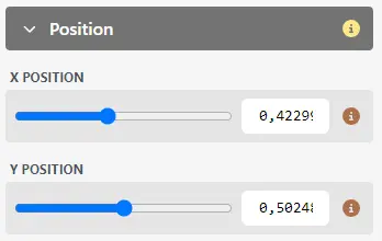
If you want to move the marker, you can just drag it inside the image to place it where you wish. However, for more fine-grained placement, you can adjust the individual X and Y positions here.
TIP
If you are working in a 360° object, please refer to this page for marker placement
Icon and display
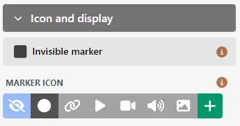
By default, markers are displayed as a simple circle element. In this panel, you can change this:
Invisible marker: if you select this option, the marker will not be displayed at all in the Micrio viewer. It will have no relatable HTML element. Useful cases for this are:
- This marker is part of a marker tour, and you don't want your visitors to open this tour step by themselves
- This marker is used as positional audio element (see below), and it does not have any other relevant content.
Marker icon: Here, you can select a pre-defined icon that will be used to display this marker. You can also upload a custom icon using the "+"-button.
TIP
Any uploaded custom icons can be re-used within this image, so you won't have to re-upload the icon for each marker
Additionally, you can also select "No icon". This differs from the Invisible marker option, that the marker will still be placed in the viewer HTML, just without any default styling. This allows you to apply your own CSS to the marker, for instance.
Tags
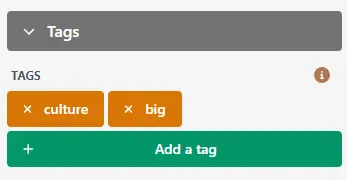
If you have a lot of markers, or you want to group them for custom styling or behaviour if you have embedded this image in your own website, you can add Tags to individual markers.
Tags by themselves have no effect on the default Micrio UI. However, it allows you to easily customize tagged markers in the <micr-io> embedded viewer:
Tags are CSS class names
Each tag you give to a marker, will be added to the clickable marker's HTML-element in the Micrio viewer, allowing you to directly target it using CSS.
For instance, a marker with a tag "culture", will have this HTML element in the viewer:
<div class="micrio-marker culture default" id="..." style="...">
	<!-- the inner object -->
</div>
Meaning, if you want to give each marker with tag "culture" a different color using CSS:
.micrio-marker.culture {
	/* All "culture" markers are blue */
	--micrio-marker-color: #0f0;
}
Marker tags can be accessed by JavaScript
Additionally, if you want to attach specific behavior to markers, you can find these elements by searching/filtering the Marker elements in the MicrioImage.$data.markers[] array:
// Get all image markers with "culture" tag
const cultureMarkers = YourHTMLMicrioElement.$current.$data.markers
	.filter((m:Micrio.Models.ImageData.Marker) => m.tags.includes('culture'));
Label
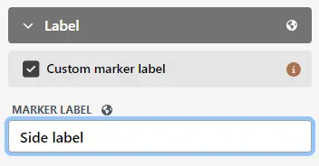
By default, when the visitors hover the marker element, the marker's title will be printed next to it as a label.
Using the "Custom marker label" setting, you can set your own label that will appear next to the marker element. This is useful if your main marker title is very long, for instance.
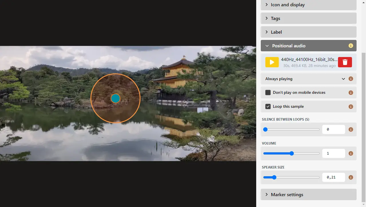
Positional audio
INFO
In the previous dashboard, this was a separate content item "positional audio". In this dashboard version, that functionality has migrated to be a property of a marker
If you want to enrich your image with positional audio, ie. have audio effects play at a certain location in your image, you can use this function.
It allows you to physically place audio elements in the image, that will move together with how the visitor is viewing your image. If they zoom in, the audio will get louder, and if they pan through the image, the audio will move along with this marker's position.
This is great for very immersive storytelling projects, and allows you to create a dynamic soundscape through your images.
TIP
This is not to be confused with the marker popup audio property of this marker
By using this panel, you can upload an audio file from your computer (MP3 format), which will be connected to this marker's position. So if you move the marker, the audio will move together with it.
The panel settings are:
Playing mode: By default, the audio file will automatically play when the image is opened, meaning that the visitor will hear the audio all the time. Alternatively, you can set this to only play when the marker is opened.
Don't play on mobile devices: In order to have a more minimal viewing experience, or to save mobile bandwidth, to not play this audio sample on mobile devices.
Silence between loops: If you have an audio sample that you only want to play sporadically (for instance, the sound of a door opening), you can set a pause between loops in seconds. Set this to
60, if you only want the sample to play once a minute.Volume: The relative volume that this audio sample will be played at.
TIP
This does not influence "how far away" you will hear the sample in the image! Use "Speaker size" for that.
Speaker size: This corresponds to the orange circle you see around the marker element in the editor. This is the cone size of the speaker-- it is not the limit where the visitors will hear it, but rather how powerful the audio file will be. Make this very small, and the user will have to zoom in fully to hear it. Make this very small, and the user will hear the audio no matter where in the image they are viewing.
Marker settings
The "Marker settings" panel has a direct link to the main image's Marker Settings, where you can set image-wide settings such as default label display, automatic marker clustering, and more.