
Custom Micrio integration example Client 5.x
This page is about the Micrio client version 5. Use the links below to navigate to alternative versions.
This tutorial takes you step by step to creating your own custom styled image marker icons, and popups. You will learn how you can create differently styled markers, and write your own custom marker popup CSS.
TIP
The full example for this tutorial can be found HERE.
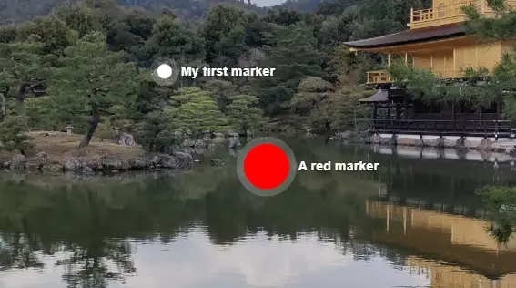
1. Create your markers
Firstly, upload an image, and create some different markers:
Steps
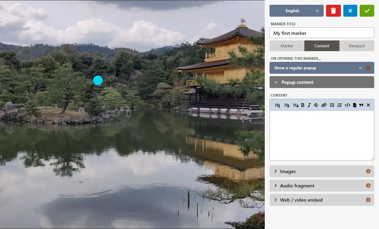
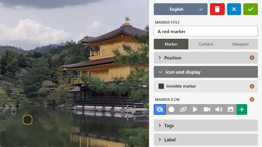
Click the "Content" tab in the sidebar
Select the "Markers" tab if it's not already opened
Click on the "Create" button
Click on the image where you want the marker to be placed
Enter a title, and select the "Content" tab to enter a body text
Optional: If you want different markers to look differently, you can assign custom class names (or tags) to individual markers. To do this, open the "Marker" tag, and add a name -- something like
red.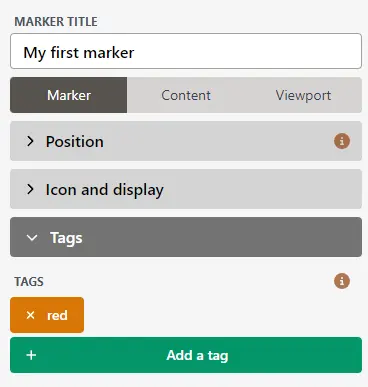
Click the green ✓ "Save" button on the top right to save this marker
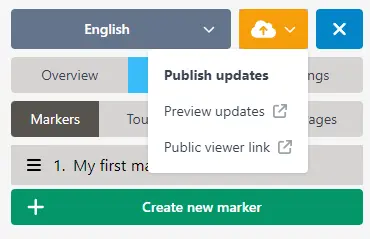
Then publish your image by clicking the orange Publish button on the top left, and then selecting "Publish updates":
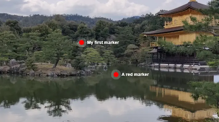
Your image is now ready to be embedded in your own page, that we'll make next!
2. Embed the image in your own HTML page
Follow the previous tutorial step to get your own HTML document with the image embedded, and set the ID of the <micr-io> element to your image's.
Open that HTML file in your browser, and you will see your image.
3. Writing your custom CSS to style the marker
This section explains how you can customly style your own markers and popups. This is done by using CSS, or Cascading Style Sheets.
If you are new to this, please follow a tutorial to get started. There are many great resources online to teach this. For instance, check out this CSS tutorial at w3schools.com.
TIP
Micrio v5 uses easy to modify CSS Variables, so you can style your entire Micrio look and feel using those. See this page for all available CSS variables.
Styling all markers using regular CSS
Micrio markers have the css selector
micr-io button.micrio-marker. That means you can customly style a marker by using the CSS variables; for instance adding this to the<style>part of your HTML or your CSS file:cssmicr-io .micrio-marker > button { --micrio-marker-color: red; }This will have the markers look like this:
Custom individual markers
If you want to individually style markers, for instance the one we created with the class name red, this is also easy:
The class names given to markers in the editor are rendered in the client as
{your name}, and will be put on the main.micrio-markerelement. For instance in ourredexample, the marker class in the HTML will bered.That means we can style this marker individually by using the following CSS rule:
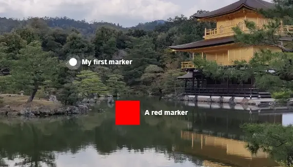
cssmicr-io .micrio-marker.red > button { background-color: red; /** You can also use the Micrio CSS variables here */ --micrio-marker-size: 50px; }This CSS rule will work for all markers that have the editor class name
red!This results in the following marker:
Congratulations, now you can target custom markers!
How about the rounded corners and white borders?
It seems all markers you create look kind of the same. They have a round shape with a white border, and a light drop shadow. This is actually the default styling, that we saw earlier in the editor.
If you specify your marker to have no icon in the editor, your marker will at first hand be invisible! Since there is no CSS styling at all for it now, it will be put on your screen and you can interact with it, but there will simply be no styling.
This however also adds more control over the custom marker styling. For example, let's remove the default styling from our red marker, and play around with it a bit:
In the editor, in the "Marker" panel, open the "Icon and display" sub-panel.
Select it to have no icon (though not the "invisible" option, since that will not render the marker at all)
Re-publish the image, and reload your HTML page in the browser. Now it will just have the custom CSS from the previous step, and will look like this:
Now it's totally in your control to make it look exactly like you want to. You're getting the hang of it!
4. Styling the marker popup
Now that you've got the basics of custom CSS styling, you can continue with styling the popup you see when you open the marker.
By default, the popups have a dark transparent, blurring background and have a static size. To style them, follow these steps:
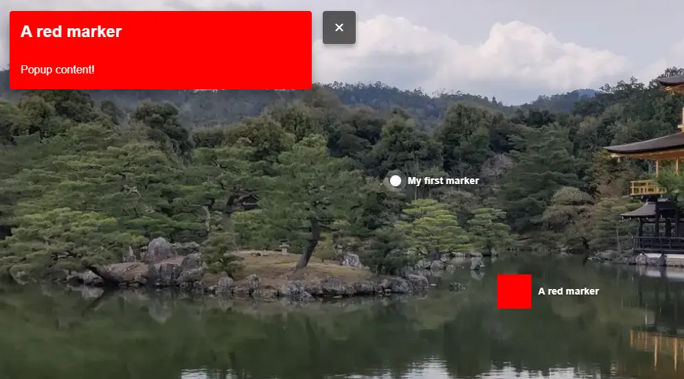
The CSS selector for the marker popup is
micr-io .micrio-marker-popup > main. If we want to give all marker popups a red background, we can use this CSS rule:cssmicr-io .micrio-marker-popup > main { background-color: red; }This will look like this:
That's it! You can now venture into the wonderful world of custom CSS, making your Micrio image and tours a wholesome custom experience.
Conclusion
In this tutorial, you've learnt how to use custom CSS to style your own Micrio images.
The full working HTML of this tutorial can be found HERE.
If you have any more questions, please drop us a line and we'll try to help you further!