
User Interface settings
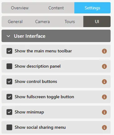
In the UI Settings, you can specify:
User interface
General user interface settings:
Show the main menu toolbar
When this is selected (default), the Micrio Viewer will show its main menu toolbar (or hamburger menu on mobile devices), from where you can start tours, or open custom made pages.
When deselected, this will not be shown, or even printed in the viewer HTML.
TIP
For dynamic showing/hiding of the toolbar of an embedded Micrio Viewer in your site, we recommend using Custom CSS to visually show or hide the element.
Show description panel
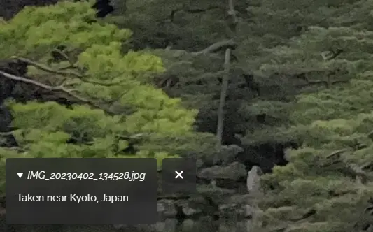
If an image description or source/copyright information has been entered to this image in the main image settings, turning this option on will display an expandable info panel in the bottom right of the viewer, which will display the description and any additional copyright information entered.
Interface theme
TIP
This option is only visible for accounts that do not have their own custom Style editor
Using this option, you can set the default UI color mode:
- Dark (default): All UI elements will have a dark background, and light text / icons.
- Light: UI elements will have a light background, and dark text / icons.
- OS Setting: Dark / light mode is selected based on the user's main OS setting.
Show control buttons

When this option is selected (default), the zooming, fullscreen, and optional social sharing button (platform dependent) and minimap will be shown. If this is turned off, the elements will not be shown (or printed in the viewer HTML).
Show fullscreen toggle button
If the above setting is selected, you can specify here whether a fullscreen button should be displayed or not.
WARNING
Not all web browsers support fullscreen mode. The fullscreen button will only be displayed on browsers that support it.
Show social sharing menu
If the above setting is selected, the control buttons will include a social sharing button that triggers the OS-native sharing functionality of sharing the current URL.
WARNING
This button will only be displayed in browsers that have a native
navigator.shareavailability.Show minimap
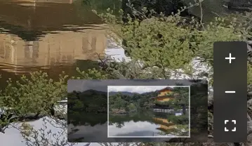
If selected, a minimap element will be shown on the bottom right next to the control buttons, when the user is currently not viewing the entire image.
Marker settings
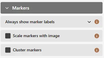
This section contains the general marker look and feel settings.
Marker labels
You can set whether or not marker label titles will be visible next to the marker elements themselves:
TIP
For accessibility, and screen readers, all marker elements have the
titleattribute of those individual markers. So, hovering your mouse over a marker element, or using a screenreader, will still tell you each marker's label.- Always show marker labels (default): Marker labels are always visible next to the marker elements themselves.
- Show marker labels on hover: Only when the user hovers, or focusses a marker element, will the label be made visible. This works well when you have a lot of markers.
- Never show marker labels: Labels are never shown.
- Labels on the side of the screen (only for 360° objects): To prevent excessive overlapping of rotatable objects, the marker labels will be printed on the sides of the viewer screen, connected with a thin line to the individual marker elements.
Scale markers with image
By default, marker elements are always the same size in your screen, independent of how far you are zoomed in or out of the image.
Turning this option on, will make the marker scale together with your image, as if the markers are part of the image themselves. If you zoom in further, they will appear bigger, if you zoom out, they will appear smaller.
TIP
If you have a very high resolution image, turning this option on will make your markers so small, you might not immediately see them.
To solve this, you can use Custom Styling for your Micrio image to make the markers larger, by for instance setting the CSS variable
--micrio-marker-sizeto a larger value.Cluster markers
If your image has a lot of markers, which overlap eachother, this could result in a cluttered user experience, making it unclear for the user which marker to click on.
When this option is turned on, overlapping markers in the viewer will be clustered together, resulting in a special cluster marker, showing the number of markers under that cluster.
When that cluster marker is clicked, the camera will zoom to the area of the underlying markers, so that they are separately visible and clickable.