
Style editor Premium account
INFO
This feature is available for Premium subscription accounts.
The Micrio viewer is easily customizable using CSS when it's embedded in your own website. See also Styling the UI.
However, you can also apply styling from the Micrio dashboard, to ensure that all of your embedded images have your own branding, look and feel, no matter where they are embedded.
The "Style editor" tab in the Group Settings screen takes you to a user-friendly visual UI settings page.
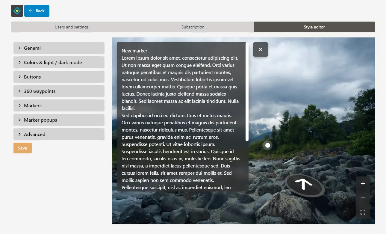
On the left side, you can fold out each section and set custom values for many different things. On the right side, a live preview is shown of how your Micrio UI will look based on your changes.
Below, all individual settings are explained:
General
General overall UI settings:
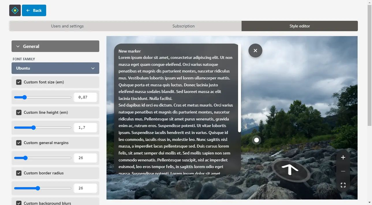
Font family: here, you can choose the default font family to be used. By default, the font family is the same as the webpage it's embedded in, but you can override this by choosing from a pre-selected list of fonts from Google Fonts.
Alternatively, you can also supply your own fonts using the "Advanced" section below.
Font size: Set your own preferred font size (
emunits)Line height: Set your own preferred text line height (
emunits)General margins: Override the margin sizes from the borders of the viewer
Border radius: Set your own rounded borders or turn it off
Background blurs: By default, the Micrio background content modal and buttons are semi-transparent, and have a blurring overlay effect. You can override that here.
Colors & light / dark mode
Micrio Viewer version 5 supports light and dark modes.
By default, the Micrio interface uses dark mode (light text on dark background). In this area, you can switch it to light mode, or set it to automatic based on the user's OS preference.
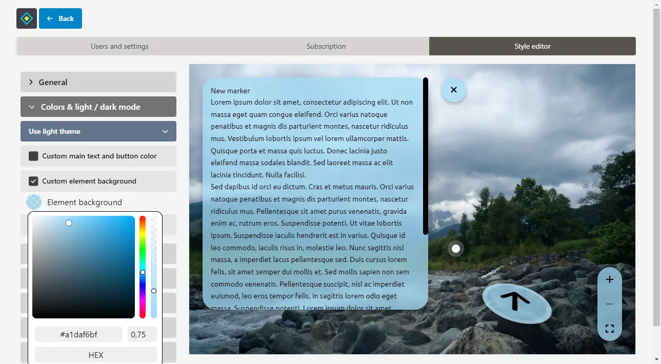
For each mode, you can set:
- Main text and button icon color: Override the text and button icon colors.
- Main background color: Override Micrio's main button and content background color.
- Button hover icon color: Set your own button icon hover color.
Buttons, 360° waypoints
In these panels, you can customize the sizing and styling of the buttons, and 360° waypoints used in virtual tours.
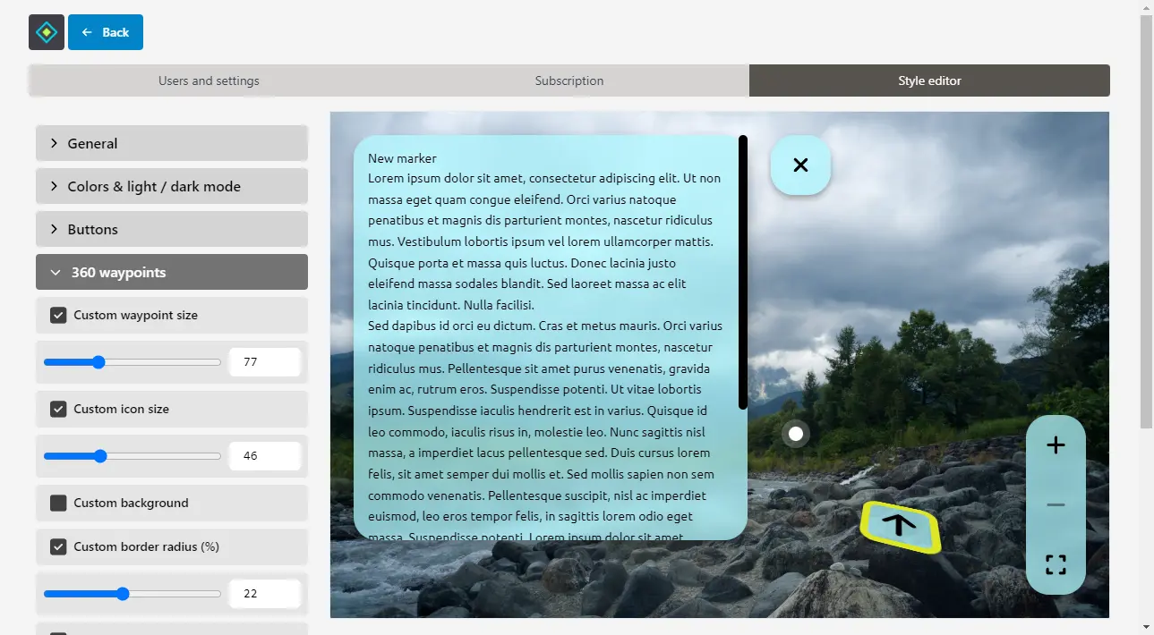
For each, you can set:
- Button / waypoint size: specify the sizing of the elements (
pxunits) - Icon sizes: the icons inside the elements (
pxunits)
For buttons, you can also set:
- Custom drop shadow: customize the shadow behind all Micrio buttons
For 360° waypoints:
- Background: give waypoints a different background color from the default Micrio background
- Border radius: by default, waypoints are round elements. Use this settings to adjust this towards a full square
- Border size: Adjust the waypoints' individual border size
- Border color: Override the border color
Markers
Set the way that image markers look.
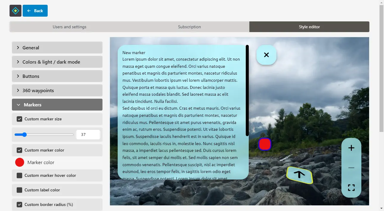
- Marker size: specify the sizing of the elements (
pxunits) - Marker color: the color of the marker elements
- Marker hover color: the color of the hovered/active marker element
- Marker label color: the color of the marker text label, when visible
- Border radius: by default, markers are round elements. Use this settings to adjust this towards a full square
- Border size: Adjust the individual border size
- Border color: Override the border color
Marker popups
By default, marker popups in Micrio open in the top left of the viewer window. Using these settings, you position it differently, and adjust its inner padding, and drop shadow.
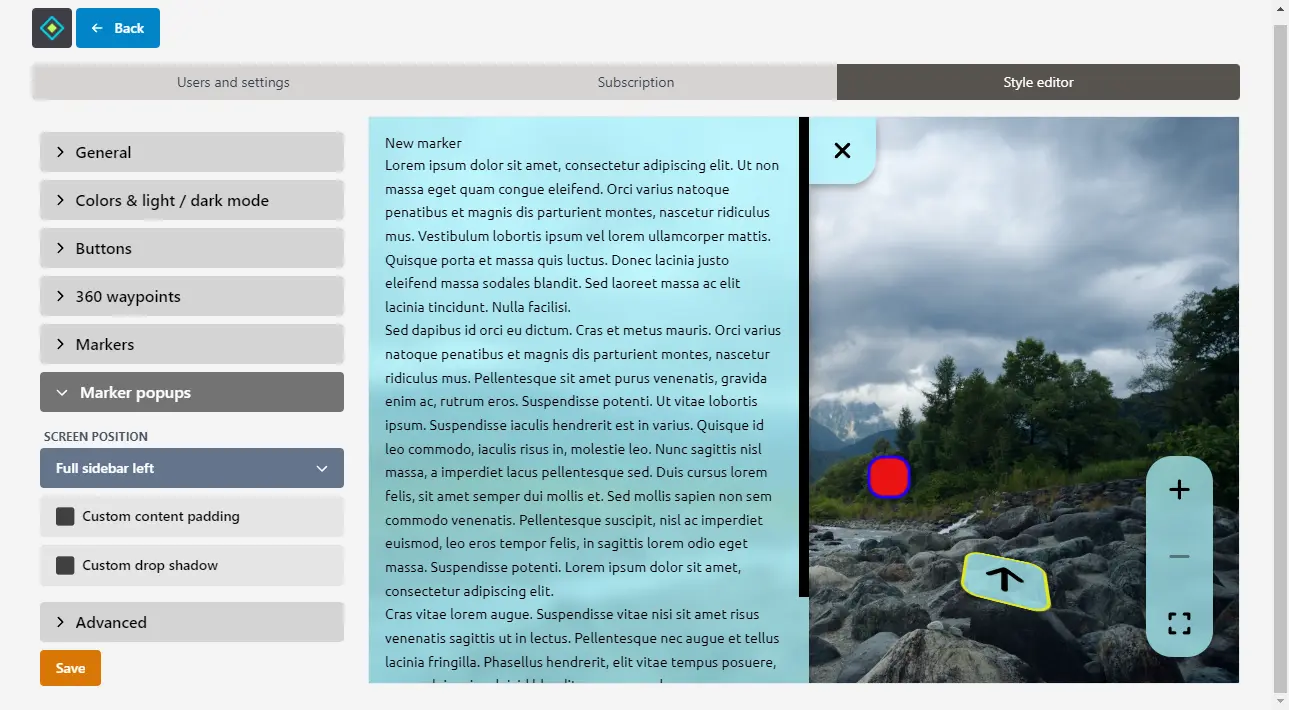
- Screen position: choose in which corner of the viewer window the marker should open, or set it to be a full-height bar on either the left or right side of the screen. This is particularly helpful for when you have longer texts for your markers.
- Content padding: adjust the inner content padding (
pxunits) - Drop shadow: adjust the marker popup's outer drop shadow
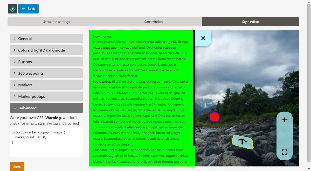
Advanced
You are also free to add your 100% custom CSS that will apply to all Micrio viewers published under your account. You have full freedom here, so even the smallest details you can customize.
Also use this for when you want to set a custom font family.
Saving, publishing
Don't forget to save after you've made changes. Once saved, your custom settings will be published automatically, and will apply to all your Micrio images.
Due to cache propagation, it could take a while before you see your changes. If you don't see your changes, try to reload the viewer page by clearing your local browser cache.